
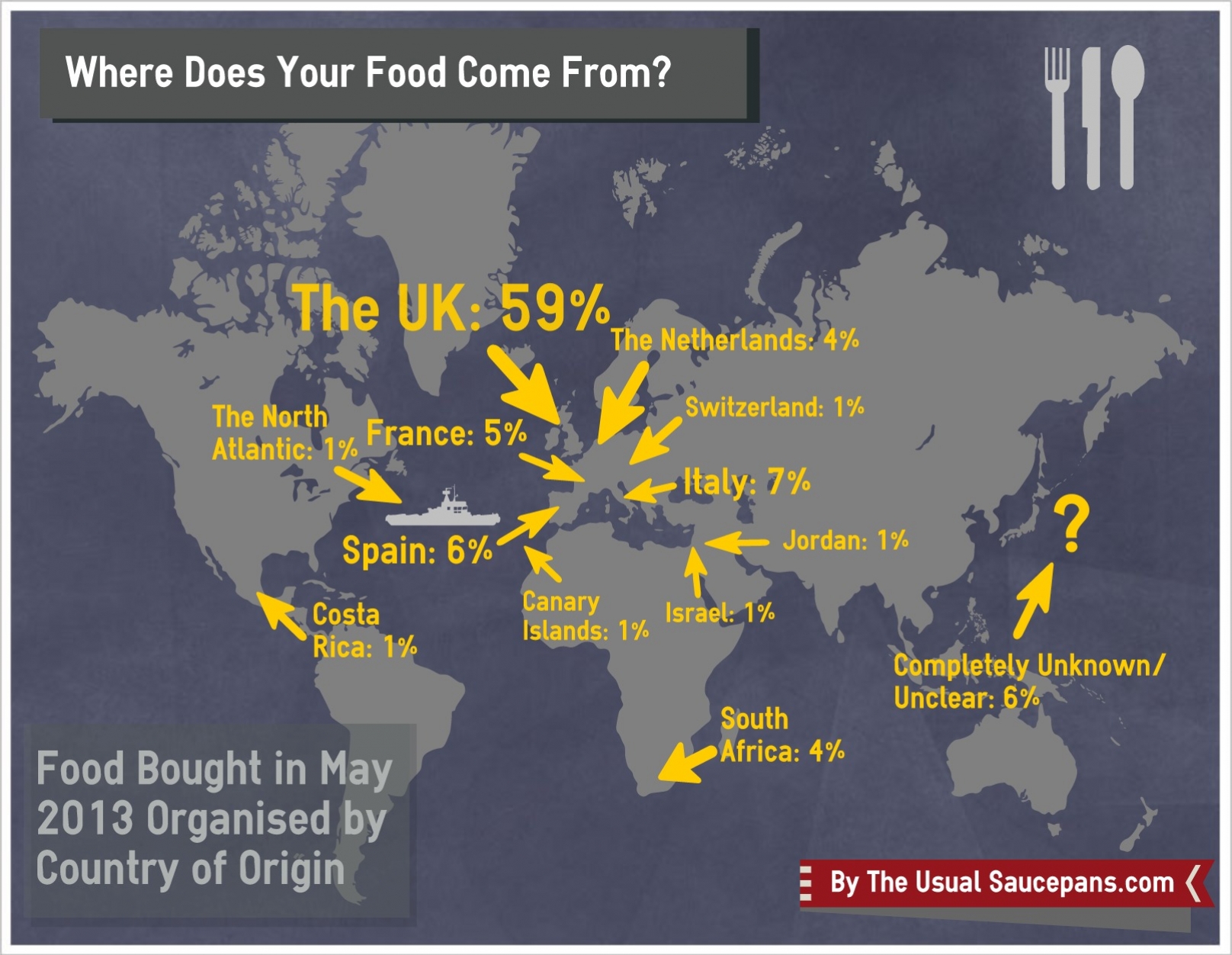
Where does the food I eat come from? That was the question I posed at the start of May. We’re all guilty of picking food up because it looks tasty and putting it in our baskets without the slightest thought of where it came from - so for the month of May I decided it was high time to start looking at those labels.
And what did I find? Well, it appears that some of my food doesn’t travel all that far (Perthshire - about 40/50 miles away - was the closest). But other things that I could, in theory, grow in my back garden are flown in from South Africa and Israel to grace the shelf of my fridge. Possibly most concerning though was the 6% of my food that I couldn’t determine the origin of. It must be there somewhere (being a legal requirement and all that), but it completely eluded me - making me think that it probably wasn’t something the producers wanted to highlight.
The best result is probably that the biggest source of my food is my home - the UK. I was going to break it down further, but my infographic making website didn’t have a map of the UK - for those interesting though, it was like this: Scotland 30%, England 18% & undefined UK 52%. Out with that grouping though, it appears that Western and Southern Europe are the main sources for my dinner. I don’t think it’s particularly surprising to see Spain and Italy pop up here - given the amount of food they produce - but I am slightly surprised that the Netherlands is not higher. Whether this is due to the time of year or just what I buy I don’t know, but I would have bet on it being around (if not over) 10%. A final thought on Europe - I can’t remember what came from Switzerland, but it wasn’t a Toblerone!
(Click on the image to enlarge)
There are a few caveats that I would put on this little study - firstly it was a bit of an odd month in which I ate out a few more times that I ordinarily would; secondly, it was only a month of one person’s food so it isn’t a particularly huge sample size; thirdly and finally, whilst I tried to remove my bias from the situation there was definitely a couple of times that I looked at a label and put it back on the shelf because of its origin - this probably doesn’t give quite the robust sort of results that should be published, but on balance I don’t consider it a bad thing.
I’m glad I did this little experiment - it’s definitely made me think more about where my food comes from. I hope it’ll change my perception of what I buy keep me from zoning out when I enter a supermarket, but I guess that only time will tell.
What do you think of the results? Are there any big surprises in there?
It also begs the question: where does YOUR food come from?
If you liked this post, why not Like The Usual Saucepans on Facebook?


That’s actually about the breakdown I’d expect for someone who’s a conscious shopper but not obsessive about it. I wonder whether it’s easier to buy British than it was 10 or 15 years ago since I would think demand for it has grown. I had a little chart showing what is in season when in Scotland which was really handy because most UK info on that pertains to England, but I lost it and can’t find another, annoyingly. I buy frozen fruit a lot, since I cook with it, and freeze citrus juices and zest, but with the latter I should look into where the fruit is coming from at which times of year. Interesting stuff, anyway.
Yeah, I wasn’t wildly surprised - but there was definitely something from Kenya and something from somewhere in Central America that I put down again because it was ridiculous. I do a chunk of my shopping at the local farmers’ market too, so that probably helped. Maybe a ‘what’s in season in Scotland’ guide can be my next project - definitely sounds like a good reference to have! Frozen fruit tends to be fairly local, I think, but it would be something I’d check now. Glad you found it interesting!
I’m surprised how much came from the UK, but then I remember you saying that you try to buy local. I do love the infographic! The break down and analysis of your results are of course the mark of a true scientist.
I’m now inclined to pay a little attention to where the food I buy comes from!
Yeah, it is slightly higher than I had initially expected too - but as you say, I do try to buy local and I’m a bit obsessed with the hog roast rolls at the farmers’ market… Ha ha, I doubt it would be robust enough to get through peer review, but I can’t quite shake the scientific pull (and mocking my poor data set).
Me too, it’s definitely made me think about it more - although by the sounds of it we should all be reading Jay Rayner’s new book and throwing that mentality out the window…
Ooo interesting! I do love a good infographic. I wonder if the percentage of your food from NL would be higher in winter since they tend to go in for greenhouse farming. I’m intrigued by what came from Jordan and the Canaries? Also, you haven’t explained your methodology in detail – did you just look at fresh produce, or also dry goods, etc etc etc. No Nature paper for you 😛
Cheers! Yeah, that’s what I’m thinking with the NL produce - I think it would have been higher in winter time. I can’t remember what the Canaries was, but I think (shamefully) Jordan was something ridiculous like fresh basil (I needed it for a recipe, otherwise I’d have drawn a line at that!) Ha ha, true - I didn’t want to make to post too long, but skype me and I’ll be happy to go through all the details, if you wish 🙂
Ok, I’m actually intrigued. If I remember (haha), I’ll ask on our next Skype date. Oh how interesting – I genuinely have no idea what Jordan produces. Also I feel there’s a joke in there about canary pie or something, but I’m too tired to come up with one, so you’ll have to think of it yourself…
Oh, it’s not that in depth - it was just anything consumable that I bought. No, nor do I (apart from, potentially, basil). I don’t think I’m much more on the ball, sadly, but if I come up with something I’ll let you know.